Stolly - My rough rule of thumb is that you and Noel can be so close to being on the same page as me, and then you blow it by making an assertion that doesn't stack up with what you've said even in the same post.Originally Posted by Fellbeast

First paragraph - OK let's accept that. The conclusion in paragraph 2 is misleading.
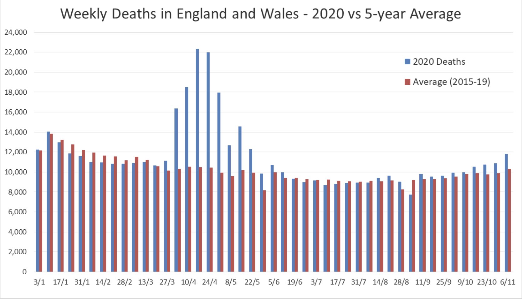
Based on your 8% and 0.8% you would need 9% of people to be infected in the population before the False Negatives became statistically more significant than the False Positives.
That's more than 10x the declared rate of infection even in the hottest of UK hotspots.
Noel -
"So, as we've said before in the current situation, false positives aren't as much of an issue as false negatives.
However, if we get to a situation of very low infection rates, but very high levels of screening, false positives become (relatively) more important."
First paragraph - you see it's wrong. The rate of false positives might be much lower, but it is a far more significant number because of the low prevalence of covid in the community.
So to say FPs aren't as much of an issue is incorrect.
When you are talking about lower rates and higher rates, we haven't even come anywhere near the higher rates at which false positives become less significant than false negatives.
I'll say it again, because it doesn't seem to have registered.
Taking Stolly's rates, you can go and test in any town in the UK and False Positives will place it at the top of the charts. It will be the hottest of hotspots in the UK with 800 cases per 100,000 population.
So I'm against bad testing, which is what we have with the PCR test.
The results of the testing have driven UK Government policy and world policy for 6 months.
And the experts at SAGE and our Government act as if there is nothing to see here.