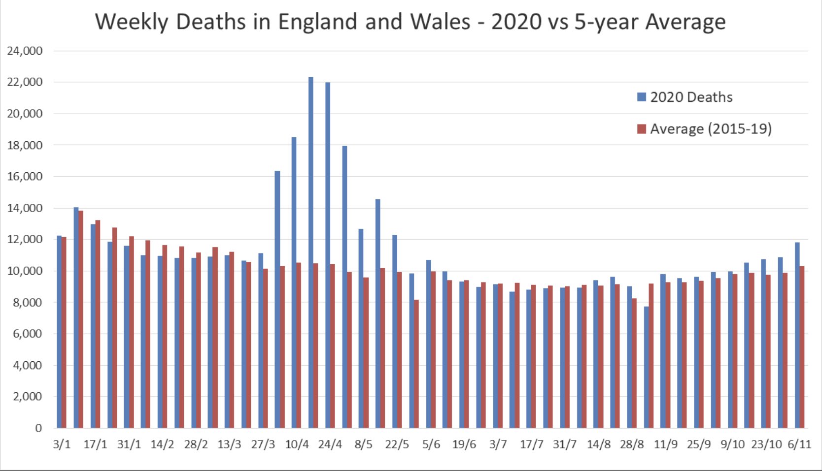
Yes it is illustrative - although in several of the 5 years used to produce the average the bars would be similarly higher than the average and possibly there was a year where - apart from the huge peaks in April /May - a similar chart for an individual "bad flu year" would show a similar one year pattern not vastly different to 2020?Originally Posted by Fellbeast